Zimbra has released a new Universal UI and it looks awesome. It is a re-designed user interface for Zimbra Collaboration that includes modern standards and improves the user experience.
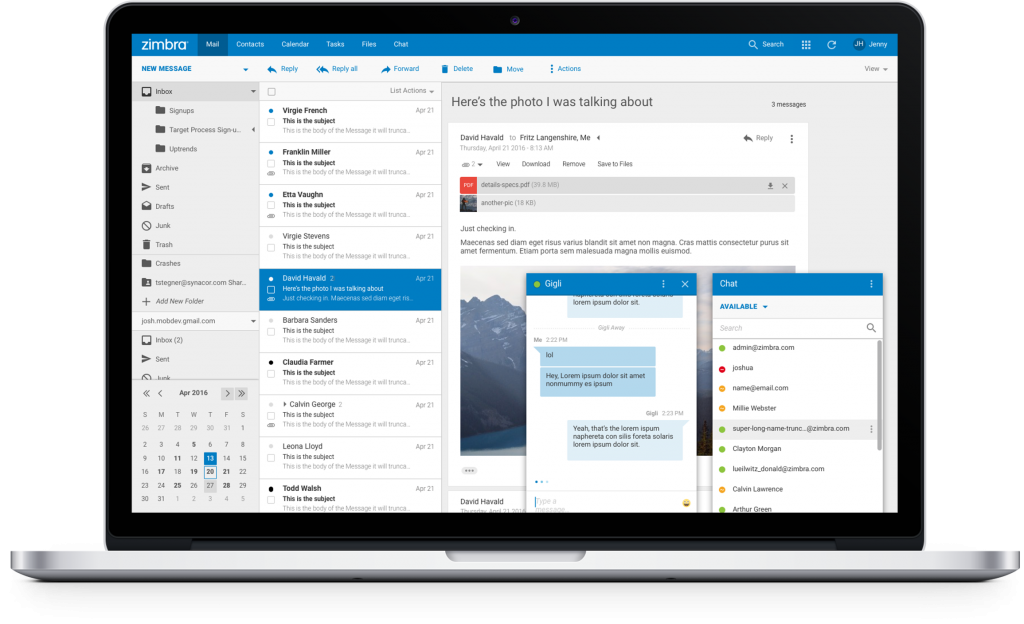
Try the new Universal UI – Cloud Based
You can try it today without install anything! Click the link below, follow the instructions, and in a few minutes you will receive a Zimbra Login URL, username and password. Do any tests you like: import an old .tar.gz from another demo Zimbra account, send or receive emails, create appointments or contacts, etc.
Try the New Universal UI – Build
If you are an active Developer, or if you want to test the new UI with your Zimlets or your own developments, we have a build for Developers. Please do not use this build in Production. Zimbra Support does not offer support or advice about this build.
Improved Features
The Zimbra Universal UI was built to preserve the Zimbra essence and know-how while improving the functionality and the overall user experience. Many improvements now provide a better experience to users in a much more intuitive interface.
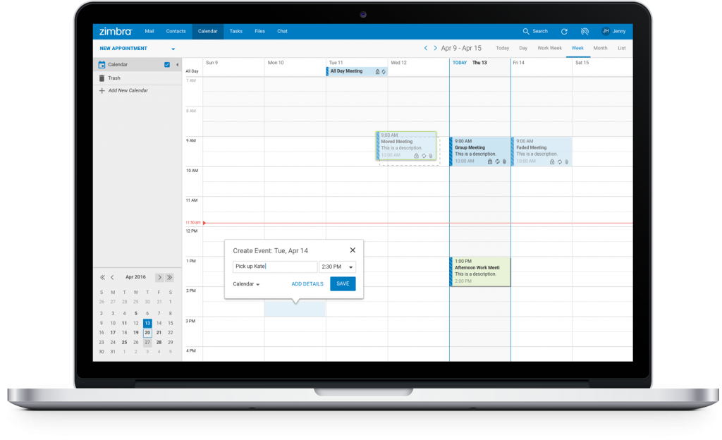
New Calendar View
The Calendar view was redesigned with a modern and fresh appearance. One of the highlights is the new way to quickly add events, without popups, to improve user efficiency.
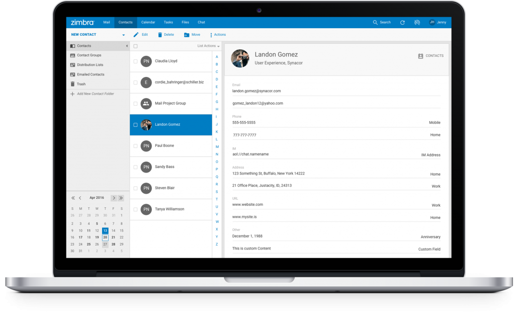
New Contacts View
For the Contacts view, we offer a more modern avatar display. If the user doesn’t have a picture yet, Zimbra will show the initials of the contact.
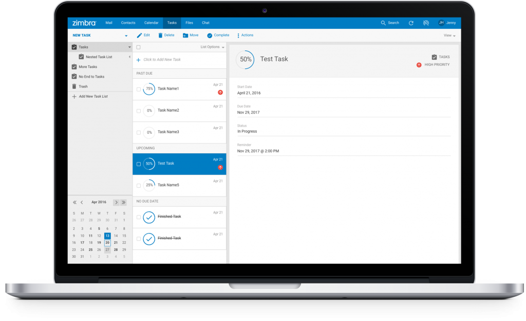
New Task View
The Task view shows a modern and fresh view of the Task status by changing the progress bar into a progress circle.
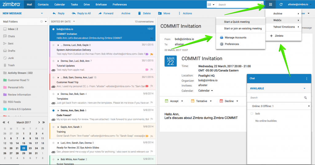
Zimlets: The Crown Jewel
Our Zimlets are, without a doubt, one of our biggest assets. Now they are at the top of the menu bar, where users can locate their Zimlets faster and interact with them with less effort/fewer clicks. This change shows Zimbra’s commitment to our Technical Partners and Developers who build extensions and Zimlets for Zimbra while we continue to improve the product at the same time.

