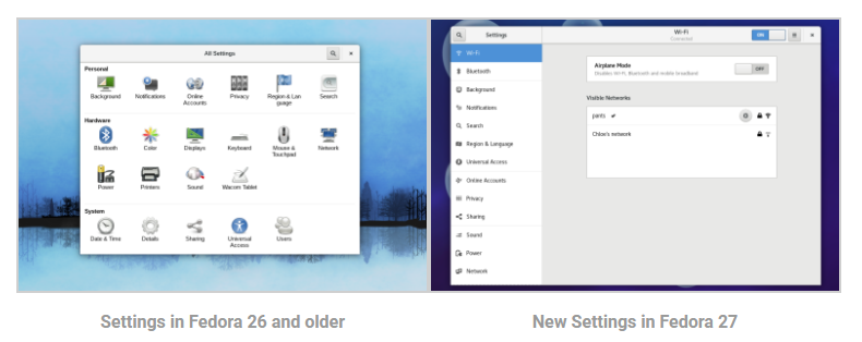
Fedora 27 Workstation is slated for release later in the year, and it ships with version 3.26 of GNOME. One of the awesome changes from upstream GNOME that is shipping in Fedora 27 is the re-designed Settings application. The new Settings has moved from a grid layout to a side panel, and several of the pages — like the display configuration — are also redesigned.
Side panel navigation
Previously, the Settings application provided navigation between the pages of settings using a grid of icons. In Fedora 27, navigation between the pages is done via a new side panel. This is similar to the layout of the GNOME Tweak Tool, and allows you to quickly and easily switch between pages of settings. Moving away from a gird layout, the settings application window is now resizeable and does not feel as cramped as in previous releases.
Display Configuration
The display configuration page is completely revamped in Fedora 27 / GNOME 3.26. It now provides all the settings for configuring multiple monitors on a single page. The previous incarnation of this page required the user to drill down to change settings, and this revised layout makes it much quicker and easier to configure multiple monitors.
